brand design
Every great brand starts with a spark of an idea. Whether you're launching a new business, turning a passion project into something tangible, or sharing your creativity with the world, the way you present your story online can make all the difference. Together, we'll craft captivating and meaningful visual narratives that not only tell your story but also resonate with your audience. Let's transform your vision into a brand that truly shines.
kronendach
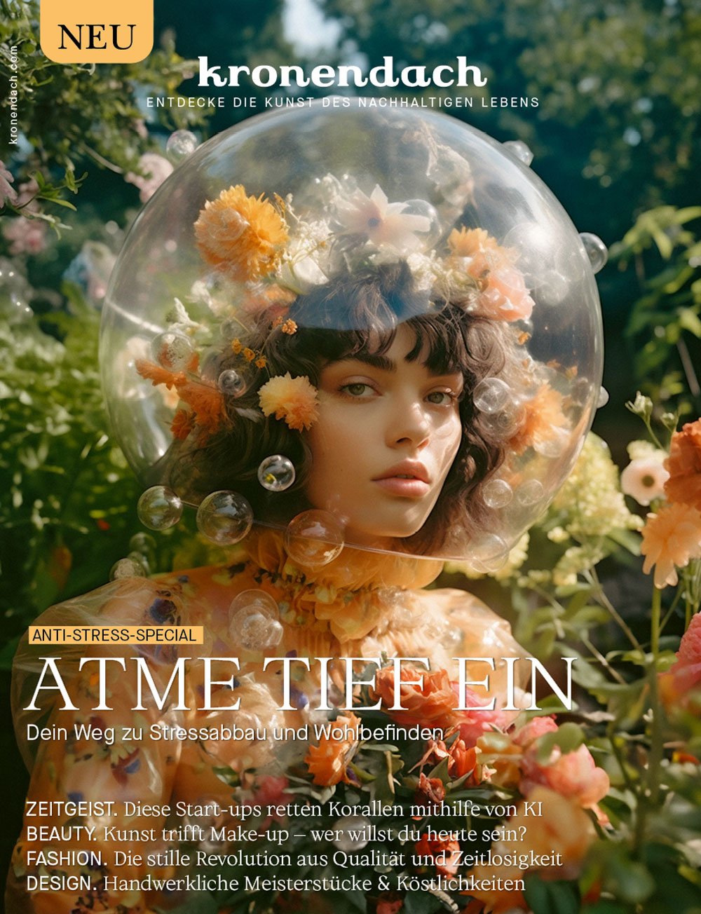
Funke Media GmbH Germany extended a prestigious invitation to collaborate on a project of profound significance: the creation and development of the brand identity for kronendach, a visionary lifestyle sustainability brand crafted specifically for the German market. This initiative sought to breathe life into a new concept, bridging the gap between storytelling, culture, and sustainable living.
Our mission was clear: to capture the essence of kronendach through a stunning and memorable brand design that embodies sustainability and mindful living. Inspired by the harmony of tradition and innovation, we embarked on a creative journey to craft visual elements that would resonate deeply with their audience. From the elegant logo to the cohesive branding materials, every detail was meticulously designed to reflect the core values of kronendach: authenticity, sustainability, creativity, and cultural richness.
Explore how our collaboration with Funke Media GmbH Germany brought the spirit of kronendach to life. Join us in celebrating the seamless blend of heritage, contemporary design, and sustainability that defines this unique brand, tailored perfectly for the German market.
The Brand’s Manifesto
Our journey began with understanding the heart and soul of kronendach, encapsulated in its powerful manifesto:
"kronendach, the canopy of a forest, is a green shelter that protects all beneath it. We brought kronendach to life to bring together people and ideas that inspire you. To show you new ways to shape your everyday life so that it feels right. Discover with us the art of sustainable living. Breathe deeply. Join the journey. Welcome to kronendach.
Creating the Brand Identity
Our objective was well-defined: to capture the essence of kronendach through a memorable brand design that embodies sustainability and mindful living. Inspired by the harmony of tradition and innovation, we embarked on a creative journey to craft visual elements that would resonate deeply with their audience.
Logo Explorations
We began with the logo, seeking to create a symbol that was warm, inviting, and evocative of nature and sustainability. Through various explorations and iterations, we honed in on a design that perfectly encapsulated the spirit of kronendach.
Lookbook Development
Next, we moved on to developing a comprehensive lookbook. This collection showcased the visual and thematic elements of the brand, providing a cohesive and inspiring reference that illustrated the harmonious blend of heritage and contemporary design.
Digital Presence – Website & Social Media Development:
With the brand identity firmly in place, we extended kronendach's presence into the digital realm. We designed and developed a website that reflected the brand’s philosophy and aesthetics. Additionally, we launched social media channels on Instagram, Facebook, and curated kronendach playlists on Spotify to engage the community and spread the message of sustainable living.
Partnerships
Recognizing the strength found in collaboration, kronendach has proudly partnered with kindred sustainable brands such as Oskar Oatbar and MSTRY. These partnerships are more than just collaborations; they are mutual commitments to promoting sustainable practices and mindful living. Together, we’ve created integrated campaigns and content that further the conversations around sustainability, health, and wellness.
Print Products
To further cement the brand's presence and reach, we produced a range of print products:
- kronendach Magazine: A periodical that delves into various aspects of sustainable living, culture, and inspirational stories.
- kronendach Books Series: A compendium on sustainable food, interiors, architecture, and more, offering practical guides and rich visuals to inspire and educate the readership.
yachiyo japanese bistro
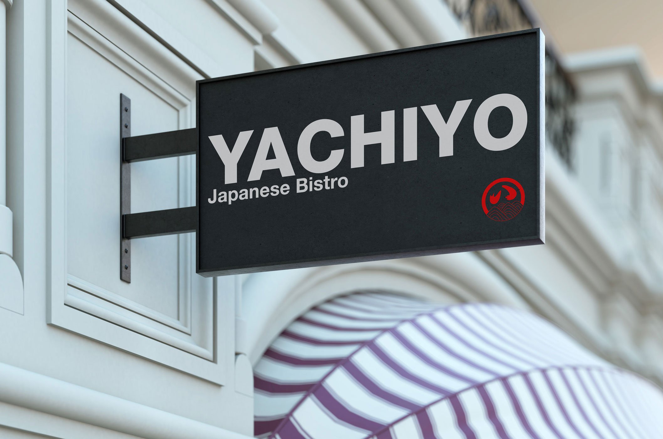
The Yachiyo Japanese bistro in Sydney has always been a beloved gem, known for its authentic Japanese cuisine. As part of its exciting evolution, I was approached to help rebrand the bistro, and I chose a minimalistic approach that would perfectly pair with its future Japandi interior style.
To reflect the elegant simplicity of the Japandi style, I employed a minimalistic color palette of black, white, and subtle touches of red, the latter of which ties back to the iconic elements of the original Yachiyo logo. This restrained use of color creates a serene and inviting atmosphere, aligning with the minimalist aesthetic of both Japanese and Scandinavian design principles.
While keeping the colour scheme minimal, the acoustic panels emerged as a key feature, infusing the space with visual and cultural vibrancy. For Yachiyo's Sydney location, three beautiful historical Japanese images were carefully recolored to harmonize with the overall minimalist decor. These panels not only reduce ambient noise but also serve as striking art pieces, connecting diners with Japan's rich historical canvas. For the Mosman location, a futuristic koi pond design was chosen. The panel depicts serene koi fish in electric, powerful colors in a stylized, modern interpretation of a traditional pond scene, offering a unique blend of calm and contemporary flair.
The rebranding effort for the Sydney Yachiyo Japanese bistro is a blend of tradition and modernity, simplicity and elegance. By merging the minimalistic Japandi style with culturally rich art elements, we've crafted an ambiance that is both inviting and refined. The thoughtful use of color and artistic acoustic panels enhances the dining experience, making each visit to Yachiyo a journey through time and design.
nexba australia
For the Nexba soft drinks campaign, our vision was to elevate the brand’s image by presenting the products with a fresh yet sophisticated touch. We aimed to create visuals that resonate with modern consumers who appreciate quality and style.
To achieve a striking visual impact, we selected a black background for the photo shoot, allowing the vibrant colors of Nexba soft drinks to truly stand out. The drinks were placed amidst ice bullets, highlighting their refreshing nature and making them pop on screen. This setting provided a sharp contrast, emphasizing the clarity and vibrancy of the beverages. Each shot was composed to be dynamic and fashion-forward, ensuring that the Nexba products were the focal point in a compelling and visually appealing manner.
Continuing with the theme from the photo shoot, the graphic design elements focused on clean lines, bold typography, and the vibrant colors of the drinks. The result was a polished yet playful aesthetic. By using minimalistic elements and a consistent color palette, we ensured the products remained the centerpiece. The designs radiated a fresh and contemporary image, perfectly aligning with Nexba's brand identity.
To complement the campaign and bring it to life, a dynamic brand activation event was planned. At the event, we featured live demonstrations, engagement stations where consumers could savor the different flavors, and interactive photo booths designed to mirror the campaign’s stylish aesthetic. This activation not only elevated brand awareness but also provided a memorable and interactive experience that closely tied into the fresh and fashionable image we created for Nexba soft drinks.


